Scott Perky’s Bi-Directional Text
Henry Perky invented shredded wheat. His son, Scott, was also an inventor, though not as famous. He invented and patented a bi-directional, symmetrical font which could be read from left-to-right or right-to-left.
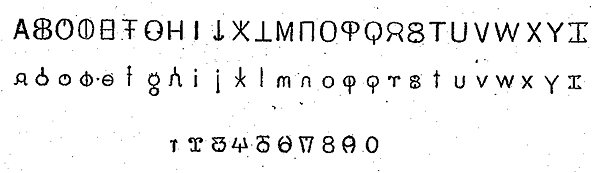
Perky's idea was that this would allow one to read a line of text from left to right, and then read the next line right to left, without having to move the eye back to the beginning of the line. This, he claimed, would reduce "brain fag":
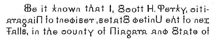
Randy Ludacer of Beach Packaging Design took the time to set the first three lines of Perky's patent in the bi-directional font, so you can experience what it would be like to read it:
Perky's idea was that this would allow one to read a line of text from left to right, and then read the next line right to left, without having to move the eye back to the beginning of the line. This, he claimed, would reduce "brain fag":
The invention consists in certain means of printing alternate lines, whereby the reading can be done from left to right and from right to left in a continuous manner, and the skipping from the end of one line to the opposite end of the next is avoided.
It is hardly necessary to allude to the strain upon the eyes and brain, which results from much reading. To students, researchers and others whose lives are cast among books, any device which promises to facilitate reading in such wise as to lessen fatigue of the optical tract, and consequent headache and brain fag, will appear of unusual importance.
It is hardly necessary to allude to the strain upon the eyes and brain, which results from much reading. To students, researchers and others whose lives are cast among books, any device which promises to facilitate reading in such wise as to lessen fatigue of the optical tract, and consequent headache and brain fag, will appear of unusual importance.
Randy Ludacer of Beach Packaging Design took the time to set the first three lines of Perky's patent in the bi-directional font, so you can experience what it would be like to read it:


Comments
Well, brain fag would be better than fag brain.
Posted by Virtual in Carnate on 10/08/21 at 06:53 AM
It's called boustrophedon. https://en.wikipedia.org/wiki/Boustrophedon
Posted by ges on 10/08/21 at 03:47 PM
Okay, I was ready for this to be ridiculous, but it was actually surprisingly easy to read the bidirectional text.
Posted by Ross on 10/08/21 at 05:09 PM
Reminds me of Cyrillic, which used some letters from the alphabet used in a Roman alphabet. But it is sufficiently different to make it hard to read at a glance for non-native speakers.
Posted by KDP on 10/08/21 at 07:35 PM
@gez: yes, but in a normal boustrophedon the letters are not symmetric. That actually makes them easier to read than this, because (if, for whatever reason, you start halfway through a text) you don't have to decipher a whole word to know at what end of the line to start. All you have to do is see which way the feet of R and K point, and where the C opens.
In this alphabet, though, the letters themselves give no clue. You have to realise that that word spells "states" and not "setats". In the worst case, you come across an entire line of words whose reverses are also words, and now you have to work out in which case the words make sense put together.
It's a cute idea, this, but too much symmetry is confusing.
Posted by Richard Bos on 10/09/21 at 05:29 AM
Commenting is not available in this channel entry.
Category: Inventions | Patents | Languages | 1900s