The Hidden Meaning of the Golden Arches
Text from The Total Package: The Secret History and Hidden Meanings of Boxes, Bottles, Cans, and Other Persuasive Containers (1995) by Thomas Hine:
The pioneer in studying people's emotional response to packages was the marketing psychologist Louis Cheskin, who began his research in the 1930s. He was long associated with the Color Research Institute and he was later immortalized by Vance Packard as the most articulate and engaging of his hidden persuaders. His seminal experiment on packaging involved placing an identical product in two different packages, one identified with circles on the outside, the other with triangles. He didn't ask his subjects to say anything about the packages. He wanted to know which product they preferred and why. He found that 80 percent of his subjects preferred the product in the box with the circles over the one with the triangles. The reason they gave was that the box with the circles was a higher-quality product than the box with the triangles — even though the contents were identical.
"I had difficulty believing the results after the first 200," Cheskin wrote later, "but after 1000, I had to accept that many of the consumers transferred sensations from the circles on a carton cover ... to the contents of the container."
...
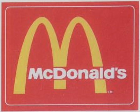
Cheskin found that a circle or an oval has the most positive association, but alone, each lacks personality. The circle or oval must somehow be inflected with some other symbolic form or identification. Thus, Tide's concentric circles are played against bold lettering, and the oval of the Amoco logo is bisected by a torch and filled with the company's name. With most packages, the rounded shape is not expressed quite so literally. But images of completeness, receptiveness, and enclosure — feminine forms — provide the underlying theme for a majority of packages. Cheskin worked with McDonald's at the time it was about to abandon arches as architectural elements of its outlets. He advised that the memory of the arches be kept in the form of the M in "McDonald's." His case was based, he said, on research that showed that "the arches had Freudian applications to the subconscious mind of the consumer and were great assets in marketing McDonald's food." In other words, Cheskin said, the arches are "mother McDonald's breasts, a useful association if you're replacing homemade food."
"I had difficulty believing the results after the first 200," Cheskin wrote later, "but after 1000, I had to accept that many of the consumers transferred sensations from the circles on a carton cover ... to the contents of the container."
...
Cheskin found that a circle or an oval has the most positive association, but alone, each lacks personality. The circle or oval must somehow be inflected with some other symbolic form or identification. Thus, Tide's concentric circles are played against bold lettering, and the oval of the Amoco logo is bisected by a torch and filled with the company's name. With most packages, the rounded shape is not expressed quite so literally. But images of completeness, receptiveness, and enclosure — feminine forms — provide the underlying theme for a majority of packages. Cheskin worked with McDonald's at the time it was about to abandon arches as architectural elements of its outlets. He advised that the memory of the arches be kept in the form of the M in "McDonald's." His case was based, he said, on research that showed that "the arches had Freudian applications to the subconscious mind of the consumer and were great assets in marketing McDonald's food." In other words, Cheskin said, the arches are "mother McDonald's breasts, a useful association if you're replacing homemade food."


Comments
Great, they have a pleasing symbol but their food still sucks.
Posted by F.U.D in Stockholm on 06/06/23 at 04:32 AM
I always remember their food as appetizing in my youth. Perhaps they've changed their formulations as well as their cooking techniques. Their french fries used to taste really good when they were fried in beef tallow. Not any longer. However, the only breasts the 'M' brings to mind are those only found in Nat'l Geographic amongst African natives. You know, size 42 long.
Posted by Brewvet on 06/06/23 at 07:40 AM
The only item on the menu I prefer is the fish sandwich. It is about the only thing on the menu that isn't a "Mc..." something.
Long live the "McBFD"!
Long live the "McBFD"!
Posted by KDP on 06/06/23 at 05:15 PM
I'm sorry, but... "Vance Packard"!? And I'm supposed to take the conclusions of someone with that name seriously? No. Just no.
(Also, the sneaky tit allusion doesn't endear him to me.)
Also also, @KPD: I'd hate a McCPT.
(Also, the sneaky tit allusion doesn't endear him to me.)
Also also, @KPD: I'd hate a McCPT.
Posted by Richard Bos on 06/10/23 at 09:22 AM
Commenting is not available in this channel entry.
Category: Innuendo, Double Entendres, Symbolism, Nudge-Nudge-Wink-Wink and Subliminal Messages | Advertising