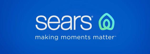
Sears unveils new logo
Sears recently spent what is certainly a large amount of money to redesign its logo. When it unveiled the results last week, it explained:
However, a lot of people have commented that the new logo looks an awful lot like the logo of Airbnb.
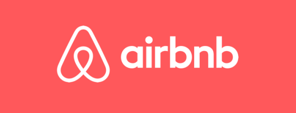
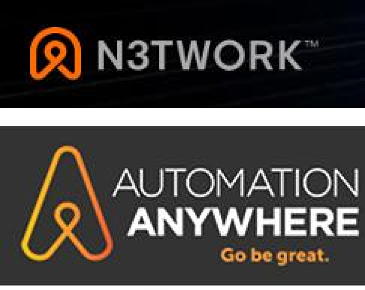
The irony here is that when Airbnb unveiled its logo, back in 2014, it was also controversial. People complained, first, that it looked too much like testicles, and also noted its similarity to existing logos, such as these:
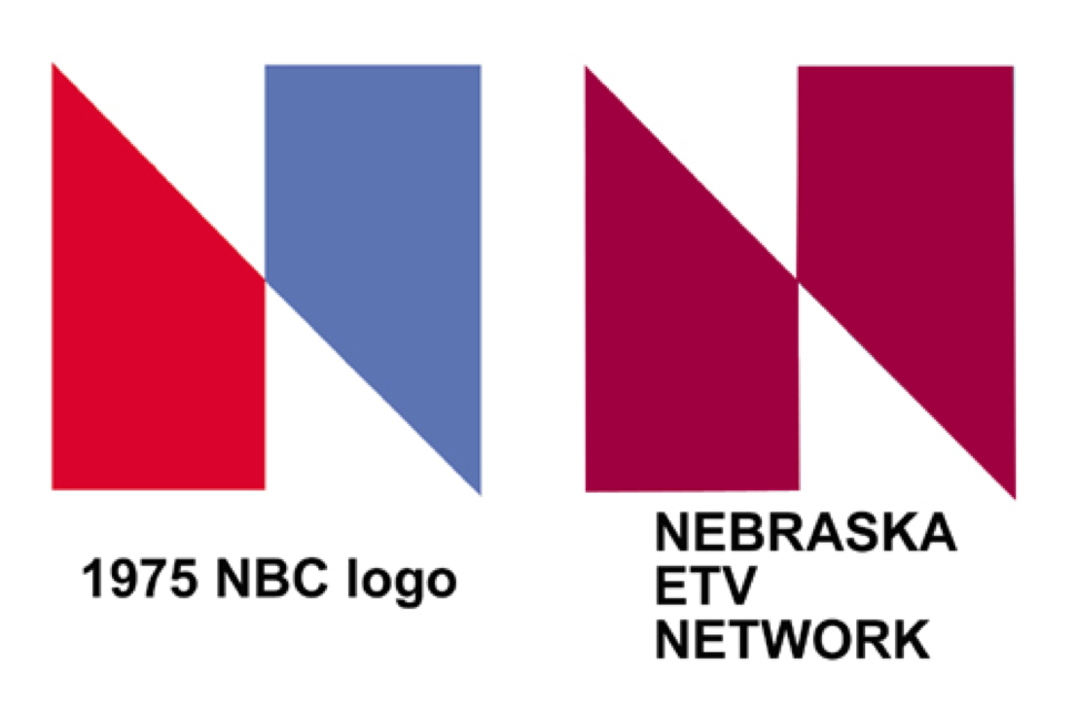
This isn't the first time a company has spent a lot of money to redesign a logo, only to come up with something similar to an existing one. When NBC TV unveiled a new logo in 1975, after spending almost $1 million for a redesign, the result turned out to be almost identical to the existing logo of the Nebraska Educational Television Network.
The new icon was created to represent both home and heart, this shape also conveys motion through an infinity loop, reminiscent of one getting their arms around both home and life. The rings, like those of a tree trunk, show longevity. With home and heart at the center, the rings radiate and grow to encompass our broad assortment of products and services
However, a lot of people have commented that the new logo looks an awful lot like the logo of Airbnb.
The irony here is that when Airbnb unveiled its logo, back in 2014, it was also controversial. People complained, first, that it looked too much like testicles, and also noted its similarity to existing logos, such as these:
This isn't the first time a company has spent a lot of money to redesign a logo, only to come up with something similar to an existing one. When NBC TV unveiled a new logo in 1975, after spending almost $1 million for a redesign, the result turned out to be almost identical to the existing logo of the Nebraska Educational Television Network.


Comments
If the Airbnb design looked like testicles, the Sears logo resembles a uterus, perhaps in the state of giving birth.
Posted by Fritz on 05/12/19 at 06:54 PM
Airbnb looks, to me, like one of those stupid little paperclips which are too small to be actually useful.
Sears . . . um . . . how do I put this delicately . . . the first thing I saw was a hood and a hard little nubbin.
Sears . . . um . . . how do I put this delicately . . . the first thing I saw was a hood and a hard little nubbin.
Posted by Phideaux on 05/12/19 at 10:52 PM
The Sears logo looks like the head and arms of someone doing jumping jacks. Airbnb looks like a cross between a nun and a Klansman.
Posted by ges on 05/12/19 at 11:26 PM
All I see in the Sears logo is a clothing iron. Their description is hallucinatory.
Posted by Virtual in Carnate on 05/13/19 at 11:34 AM
To me the Sears logo looks like a church... where laid off employees can go pray.
Even more, it looks like one of those generic logos you can buy from marketing websites for $10.
Even more, it looks like one of those generic logos you can buy from marketing websites for $10.
Posted by Brian on 05/23/19 at 10:27 PM
Commenting is not available in this channel entry.
Category: Business | Design and Designers