Amazon’s Hitler Mustache Logo, and other logo design disasters
BBC News reports that Amazon recently changed its shopping-app logo, in response to complaints that it reminded people of Hitler's mustache. The new logo (below right) is supposed to better represent a piece of parcel tape, which was the original intent, rather than a dictator's mustache.

This reminds me of the topic of logo design disasters, which I once write a short blurb about for another site. That site no longer exists, so I figured I might as well post the blurb here (below, in extended).
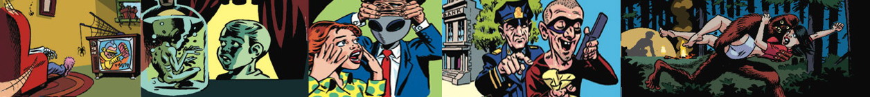
1. Tennessee Goes For Simple
Tennessee decided it needed a new logo in order to have a "consistent brand" throughout the state government. After nine months, and at a cost of $46,000, the firm tasked with the logo's creation produced the letters "TN" centered in a red square floating over a blue line. Critics were underwhelmed. Many complained that the design was so minimalist that it seemed like something a kid in grade school could have produced. The people of Tennessee voted it the winner of the "2015 Pork of the Year" contest. And finally, adding insult to injury, the U.S. Patent and Trademark Office rejected the state's attempt to trademark the logo.
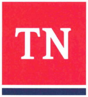
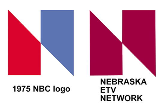
2. NBC vs. NETV
In January 1976, NBC Television proudly unveiled a new logo, a stylized red-and-blue trapezoidal 'N'. It had paid a design firm close to $1 million to develop the artwork, but within days NBC learned that the Nebraska Educational Television Network had been using an almost identical logo for half a year. The only difference was that NETV's logo was entirely red. Also, NETV had only paid $100 for its design. NETV's lawyers were soon in contact with NBC over the issue of trademark infringement. The result was that NBC agreed to pay NETV over $555,000 for the rights to the design, as well as $25,000 so that NETV could create itself a new logo.
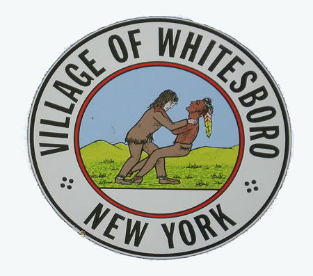
3. Whitesboro Wrestling Match
The official Seal for the Village of Whitesboro, New York shows a scene said to have taken place in 1784, when Judge Hugh White, the founder of the village, engaged in a "friendly wrestling match" with a local Oneida Indian. At least, that's the official story, but over the years many people have noted that the image looks more like a white guy choking an Indian. In 1977, the village was sued by a Mic Mec Indian from Nova Scotia who claimed that the seal had fostered prejudice against Indians in the town and had prevented him from getting work there. In its defense, the village explained that the seal had been drawn in 1963 by a local artist, who had based it on an older seal that, they swore, more clearly showed a wrestling match. They agreed to redesign the seal by moving Judge White's hands from the Indian's neck to his shoulders. But even with the redesign, which remains the official version to this day, a lot of people still think it looks like a white guy choking an Indian.
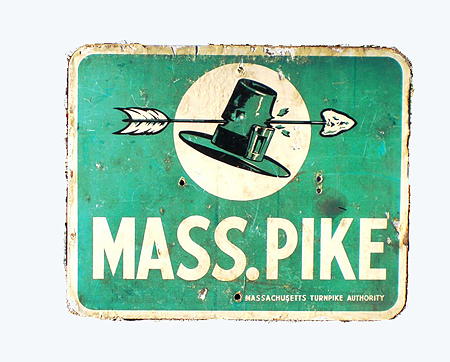
4. The Arrow to Nowhere
Around 1960, the Massachusetts Turnpike Authority adopted a logo that showed a pilgrim's hat with a Native American arrow stuck through it. But in 1989, the MTA agreed to remove the arrow, persuaded by a letter writing campaign conducted by state school children who argued that the arrow "conveyed a message of violence and aggression." It's also rumored that the MTA finally nixed the arrow because out-of-state motorists were frequently mistaking it for a directional signal when attempting to get on the turnpike, causing them to miss the entrance. This had earned it the nickname the "politically incorrect arrow to nowhere."
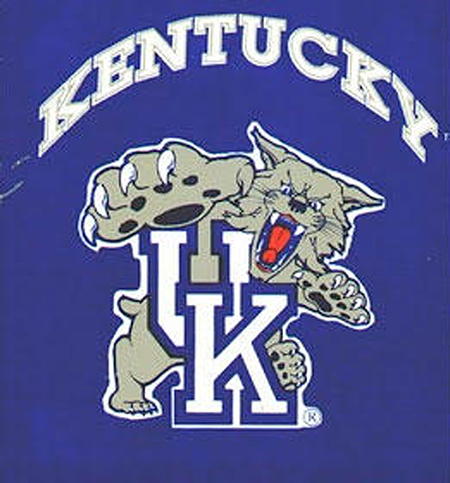
5. Is That a Rolled Tongue?
In 1986, the University of Kentucky debuted a new logo for the Wildcats. Eight years later, in response to ongoing complaints, they agreed to alter it. The complaints were that the Wildcat's rolled tongue looked too much like a penis. "We thought it was just a joke initially," a University of Kentucky representative said, "but we've had more than one call." The designer of the logo called the controversy "ridiculous," but he agreed to redraw the tongue.
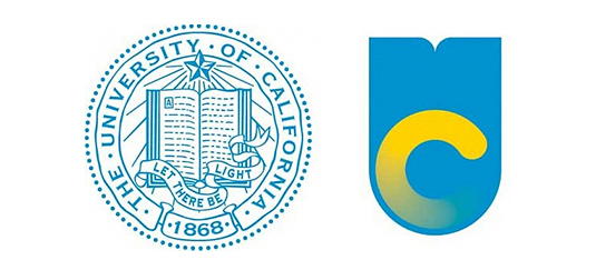
6. UC Flushing Toilet
In 2012, the University of California introduced a new logo that it hoped would provide the UC system with a more modern look. The logo showed a large, blue "U" with a smaller, yellow "C" inside of it. Unfortunately, many people thought the design looked like a flushing toilet. A petition to get rid of the logo attracted more than 50,000 supporters. And within a week, the UC system, bowing to pressure, agreed to can it.
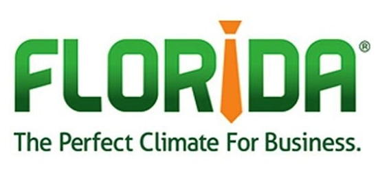
7. Sexist Necktie?
Enterprise Florida, a public/private agency whose mission is to attract new businesses to the sunshine state, conducted extensive research to design a logo that would serve that goal. What it finally unveiled, in 2013, was the word "Florida" written in capital green letters, with the letter "i" replaced by an orange necktie. A tagline read, "The Perfect Climate for Business." This immediately provoked scathing comments from female executives, who wondered if the use of a necktie was supposed to imply that Florida welcomed men only. Enterprise Florida staunchly stood by its logo, but a few months later the Tampa Tribune reported that the state legislature had quietly withdrawn funding for the ad campaign that was supposed to promote the logo.
This reminds me of the topic of logo design disasters, which I once write a short blurb about for another site. That site no longer exists, so I figured I might as well post the blurb here (below, in extended).
1. Tennessee Goes For Simple
Tennessee decided it needed a new logo in order to have a "consistent brand" throughout the state government. After nine months, and at a cost of $46,000, the firm tasked with the logo's creation produced the letters "TN" centered in a red square floating over a blue line. Critics were underwhelmed. Many complained that the design was so minimalist that it seemed like something a kid in grade school could have produced. The people of Tennessee voted it the winner of the "2015 Pork of the Year" contest. And finally, adding insult to injury, the U.S. Patent and Trademark Office rejected the state's attempt to trademark the logo.
2. NBC vs. NETV
In January 1976, NBC Television proudly unveiled a new logo, a stylized red-and-blue trapezoidal 'N'. It had paid a design firm close to $1 million to develop the artwork, but within days NBC learned that the Nebraska Educational Television Network had been using an almost identical logo for half a year. The only difference was that NETV's logo was entirely red. Also, NETV had only paid $100 for its design. NETV's lawyers were soon in contact with NBC over the issue of trademark infringement. The result was that NBC agreed to pay NETV over $555,000 for the rights to the design, as well as $25,000 so that NETV could create itself a new logo.
3. Whitesboro Wrestling Match
The official Seal for the Village of Whitesboro, New York shows a scene said to have taken place in 1784, when Judge Hugh White, the founder of the village, engaged in a "friendly wrestling match" with a local Oneida Indian. At least, that's the official story, but over the years many people have noted that the image looks more like a white guy choking an Indian. In 1977, the village was sued by a Mic Mec Indian from Nova Scotia who claimed that the seal had fostered prejudice against Indians in the town and had prevented him from getting work there. In its defense, the village explained that the seal had been drawn in 1963 by a local artist, who had based it on an older seal that, they swore, more clearly showed a wrestling match. They agreed to redesign the seal by moving Judge White's hands from the Indian's neck to his shoulders. But even with the redesign, which remains the official version to this day, a lot of people still think it looks like a white guy choking an Indian.
4. The Arrow to Nowhere
Around 1960, the Massachusetts Turnpike Authority adopted a logo that showed a pilgrim's hat with a Native American arrow stuck through it. But in 1989, the MTA agreed to remove the arrow, persuaded by a letter writing campaign conducted by state school children who argued that the arrow "conveyed a message of violence and aggression." It's also rumored that the MTA finally nixed the arrow because out-of-state motorists were frequently mistaking it for a directional signal when attempting to get on the turnpike, causing them to miss the entrance. This had earned it the nickname the "politically incorrect arrow to nowhere."
5. Is That a Rolled Tongue?
In 1986, the University of Kentucky debuted a new logo for the Wildcats. Eight years later, in response to ongoing complaints, they agreed to alter it. The complaints were that the Wildcat's rolled tongue looked too much like a penis. "We thought it was just a joke initially," a University of Kentucky representative said, "but we've had more than one call." The designer of the logo called the controversy "ridiculous," but he agreed to redraw the tongue.
6. UC Flushing Toilet
In 2012, the University of California introduced a new logo that it hoped would provide the UC system with a more modern look. The logo showed a large, blue "U" with a smaller, yellow "C" inside of it. Unfortunately, many people thought the design looked like a flushing toilet. A petition to get rid of the logo attracted more than 50,000 supporters. And within a week, the UC system, bowing to pressure, agreed to can it.
7. Sexist Necktie?
Enterprise Florida, a public/private agency whose mission is to attract new businesses to the sunshine state, conducted extensive research to design a logo that would serve that goal. What it finally unveiled, in 2013, was the word "Florida" written in capital green letters, with the letter "i" replaced by an orange necktie. A tagline read, "The Perfect Climate for Business." This immediately provoked scathing comments from female executives, who wondered if the use of a necktie was supposed to imply that Florida welcomed men only. Enterprise Florida staunchly stood by its logo, but a few months later the Tampa Tribune reported that the state legislature had quietly withdrawn funding for the ad campaign that was supposed to promote the logo.
Comments
But Hitler never smiled, did he? At least not after he got gassed in WW1.
Posted by Virtual in Carnate on 03/05/21 at 09:46 AM
The reason it's called Whitesboro is that the white guy won the "wrestling match." I guess the Oneida Indian won the match in Oneida, NY.
Posted by ges on 03/05/21 at 02:25 PM
Some images of Hitler Smiling:
https://www.google.com/search?hl=en&authuser=0&tbm=isch&sxsrf=ALeKk01Uc1VZ41VEhYMiefTF2ws9-wLA7A%3A1614977706936&source=hp&biw=1875&bih=869&ei=qppCYPfQNuj25gL_uqrIDQ&q=hitler+smiling&oq=hitler+smiling&gs_lcp=CgNpbWcQAzIICAAQsQMQgwEyAggAMgIIADICCAAyAggAMgIIADICCAAyAggAOgQIIxAnOgUIABCxA1CjBViVGGClGmgAcAB4AIABTIgBuAeSAQIxNJgBAKABAaoBC2d3cy13aXotaW1n&sclient=img&ved=0ahUKEwj3zajkhJrvAhVou1kKHX-dCtkQ4dUDCAc&uact=5
or
https://bit.ly/3ec39dI
Posted by Paul on 03/05/21 at 02:56 PM
Some people can not be happy without something ludicrously recherché to complain about, apparently. What next, cancel Google because the two O's in its logo look like a pair of breasts?
Posted by Richard Bos on 03/06/21 at 09:05 AM
I thought it was supposed to be Charlie Chaplan or Oliver Hardy
Posted by F.U.D in Stockholm on 03/07/21 at 02:26 AM
Commenting is not available in this channel entry.
Category: Business | Design and Designers